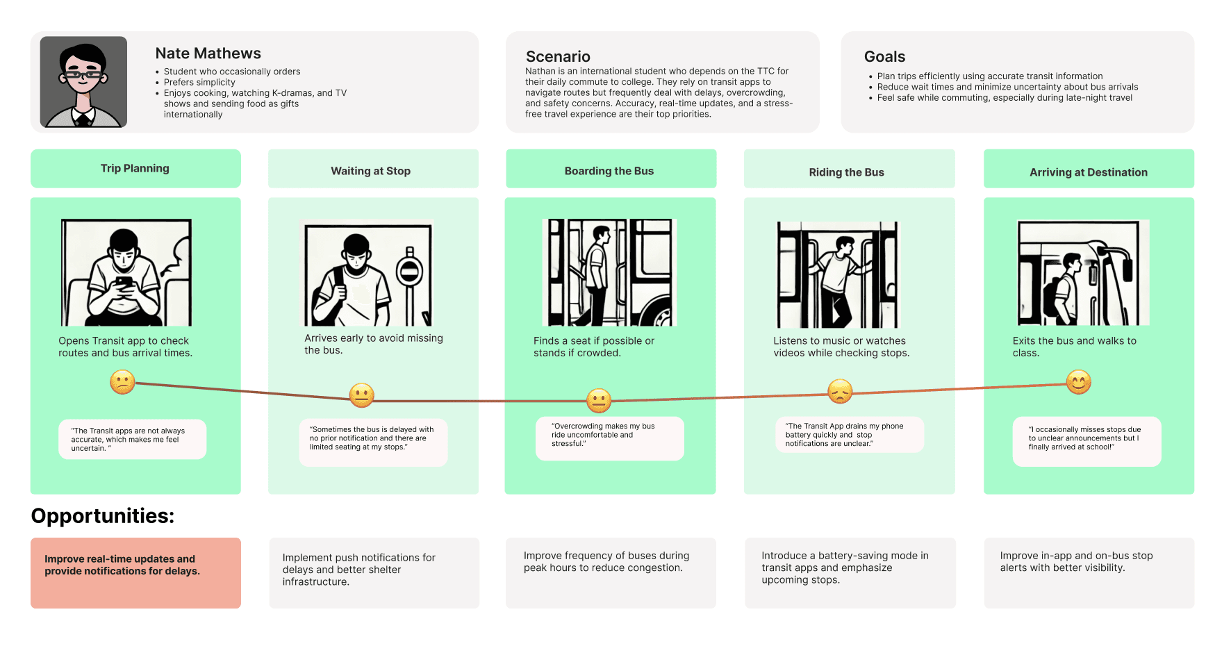
Transit App redesign: Improving transportation access in Canada
How might we minimize the impact of service disruptions on a commuter’s daily routine to increase user satisfaction?
Transit App redesign: Improving transportation access in Canada
How might we minimize the impact of service disruptions on a commuter’s daily routine to increase user satisfaction?
Transit App redesign: Improving transportation access in Canada
How might we minimize the impact of service disruptions on a commuter’s daily routine to increase user satisfaction?


Overview
My Role
Overview
In our 'Special Topics' class, we were asked to design a digital + physical improvement for Canada's most widely used public transit app, Transit App, and we had ten weeks to conceptualize, build, and evaluate the prototypes.
Designing for a live app is very different from previous projects that we did. This project, therefore, has strongly changed our understanding of designing and testing in a real-world context.
As the lead researcher, I was responsible for scoping the research, selecting the appropriate methods, coordinating a 9-person research team, and synthesizing the findings that would ultimately guide the design direction.
My Role
My Role
My Role
Design Researcher
Design Researcher,
Team Lead
(Team of 9)
Design Researcher
Team lead (Team of 9)
Tools
Figma, Figjam
Figma, Figjam
Figma, Figjam
Skills
User interviews, Usability Testing, Heuristics, UI Design
Timeline
12 weeks
12 weeks
My Role
My Role
As the lead researcher, I was responsible for scoping the research, selecting the appropriate methods, coordinating a 9-person research team, and synthesizing the findings that would ultimately guide the design direction.
Things I considered before we started
I understood that Canada’s transportation system is extensive, with several major players such as TTC, GO Transit, and Brampton Transit. From initial research, I found that the Transit App is the most widely used digital tool among commuters and serves as a key extension of TTC’s services.
Plus, since most of our team members rely on TTC for their daily transportation, we recognized that this familiarity would make it easier for us to critically review and assess the app from both a user and research perspective.
Process Overview
Process Overview
Process Overview
I followed the double diamond iterative approach. Through a loose, lean, process we managed to find calm from chaos and success while confronted with the unknown. Mixed methods research, contextual user testing, and iterative design all contributed to the success of our first phase.


Research
Overview
Research
Based on the root concept and intended users (public transport commuters), we conducted desk research, observational site visits, user interviews, heuristics evaluation, usability testing…all the data gathered were synthesized to identify patterns, pain points and preferences of the commuters. Traditional interview questions that we asked were:
Which transportation apps do you use, and why?
Walk me through a recent time you used an app for commute?
What would make this app more useful for you?
In our 'Special Topics' class, we were asked to design a digital + physical improvement for Canada's most widely used public transit app, Transit App, and we had ten weeks to conceptualize, build, and evaluate the prototypes.
Designing for a live app is very different from previous projects that we did. This project, therefore, has strongly changed our understanding of designing and testing in a real-world context.
Based on the root concept and intended users (public transport commuters), we conducted desk research, observational site visits, user interviews, heuristics evaluation, usability testing…all the data gathered were synthesized to identify patterns, pain points and preferences of the commuters. Traditional interview questions that we asked were:
Which transportation apps do you use, and why?
Walk me through a recent time you used an app for commute?
What would make this app more useful for you?


Team Collaboration
Team Collaboration
Team Collaboration
Discovery Group: handled market and competitive research
Fieldwork Group: conducted observations and interviews
Analysis Group: synthesized insights and supported reporting
As the research lead, I facilitated cross-group alignment, ensured methodological rigor, and transformed raw data into a clear insight framework to guide our design team.
Research Insights (highlights)
Top takeaways from research


Target audience - Personas & Scenarios
We identified four personas of different segments of individuals who might use our application. We did place “Men” in a single category because we felt that segment, as a whole, would be less likely to use the application. However, we would need to do more research to accurately determine that decision. The other three categories are 1) Young Adults/Student, 2) Baby Boomer, and 3) Busy Parents of Young Children


User Flow Diagram
User Flow Diagram
User Flow Diagram
Keeping our audience research in mind, brainstorming and plenty of whiteboarding, we kicked off our initial approach. Beginning with everyone on the team downloading the Transit App, provided clarity into the potential problems. We drew paper sketches to validate our initial concepts and ideas.


Exploring ideas and sketches
Keeping our audience research in mind, brainstorming and plenty of whiteboarding, we kicked off our initial approach. Beginning with everyone on the team downloading the Transit App, provided clarity into the potential problems. We drew paper sketches to validate our initial concepts and ideas.


Prototypes
Process Overview
Prototypes
Once we narrowed down the sketches, the next part was to bring out the ideas alive in the digital interface. We used Figma for Hi-Fi design and prototyping because of the gestures and the interactivity it offered. We created a few prototypes and tested it right on the screen to evaluate several factors like usability, affordance, and interactivity.
Manually Manage Schedule Trips
This was designed so that users can view, edit, or cancel scheduled trips quickly. Consequently, users can keep track of all their upcoming transit rides.Manage Routine Trips using AI Assistant
The AI Assistant (Trippy) learns users’ daily travel habits and helps them plan ahead.Trip Notifications
Users get real-time updates on delays, route changes, or cancellations so they’re always in the loop.
I followed the double diamond iterative approach. Through a loose, lean, process we managed to find calm from chaos and success while confronted with the unknown. Mixed methods research, contextual user testing, and iterative design all contributed to the success of our first phase.
Once we narrowed down the sketches, the next part was to bring out the ideas alive in the digital interface. We used Figma for Hi-Fi design and prototyping because of the gestures and the interactivity it offered. We created a few prototypes and tested it right on the screen to evaluate several factors like usability, affordance, and interactivity.
Manually Manage Schedule Trips
This was designed so that users can view, edit, or cancel scheduled trips quickly. Consequently, users can keep track of all their upcoming transit rides.Manage Routine Trips using AI Assistant
The AI Assistant (Trippy) learns users’ daily travel habits and helps them plan ahead.Trip Notifications
Users get real-time updates on delays, route changes, or cancellations so they’re always in the loop.
Prototypes
Once we narrowed down the sketches, the next part was to bring out the ideas alive in the digital interface. We used Figma for Hi-Fi design and prototyping because of the gestures and the interactivity it offered. We created a few prototypes and tested it right on the screen to evaluate several factors like usability, affordance, and interactivity.
Manually Manage Schedule Trips
This was designed so that users can view, edit, or cancel scheduled trips quickly. Consequently, users can keep track of all their upcoming transit rides.Manage Routine Trips using AI Assistant
The AI Assistant (Trippy) learns users’ daily travel habits and helps them plan ahead.Trip Notifications
Users get real-time updates on delays, route changes, or cancellations so they’re always in the loop.


User Testing
User Testing
User Testing
I used a predertermined script for the testing process and upon obtaining formal consent from test users, we achieved test results for following key tasks:
Schedule a trip (leave at, and arrive by) to college
Edit your scheduled trip
Communicate with AI assistant (Trippy)
The idea for this user testing was to figure out if the participants were able to finish the given tasks. I did a usability study with real-time users (our classmates), and cognitive walkthrough for testing our prototypes.
Changes made after User Testing
After initial critiques and walkthroughs, we realized there are a few things that need to be changed in order to come up with a good task flow. I made the following changes to the interfaces.
Participant P1, P2, P4 spent noticeable time creating scheduled trips. They mentioned that the 'Leave at' and 'Arrive by' section is confusing.
The participants liked the visual cues of the current location and destination on google maps and would like that to be incorporated here as well.


Overall Impact
Overall Impact
Overall Impact
Greater Control & Flexibility: Real-time notifications on detours remove the guesswork from commuting, especially during delays or reroutes.
Time-Saving Convenience: With Trippy’s AI-based suggestions, users no longer need to replan the same routes daily—making commuting smoother and smarter.
Data Driven improvements: Routine tracking and edits give Transit valuable behavioral data, which can inform future improvements or transit authority partnerships.
Most importantly, these improvements open doors to increased user engagement, stronger brand loyalty, and a major competitive edge in the Canadian transportation market.
Greater Control & Flexibility: Real-time notifications on detours remove the guesswork from commuting, especially during delays or reroutes.
Time-Saving Convenience: With Trippy’s AI-based suggestions, users no longer need to replan the same routes daily—making commuting smoother and smarter.
Data Driven improvements: Routine tracking and edits give Transit valuable behavioral data, which can inform future improvements or transit authority partnerships.
Most importantly, these improvements open doors to increased user engagement, stronger brand loyalty, and a major competitive edge for Transit in the Canadian transportation market.
Usability Testing: We conducted usability tests with a diverse group of users to validate the design and identify areas for improvement. Based on the feedback, we made necessary adjustments to the design.
Visual Design & Style Guide: We developed a cohesive visual language, including color schemes, typography, and iconography, ensuring consistency throughout the app. We also created a style guide to maintain design consistency in future updates.